Introduction
The mobile revolution in 2025: The digital world has changed forever and at present; mobile devices are the primary gateway to the internet. About 82% of global web traffic in 2025, comes from tablets and smartphones. A wide range of services right from browsing services and products to reading online customer reviews, and making payments online to booking tickets, customers are now living their digital lives via mobile screens. This digital transformation has forced many businesses to rethink about their online strategy.
Google, which is always at the forefront of user experience has now officially shifted to mobile-first indexing. What does this literally mean? This means that the mobile version of your website is the one that determines your ranking in search results. If you are not optimizing your mobile experience, you may be at the risk of losing your visibility, credibility, and conversions. Today, the audiences are very impatient and highly demanding. They are expecting faster loading times, flawless functionality, and a design that fits on their mobile devices perfectly than ever before.
A website that takes too long to load or displays poorly can drive users away in seconds and they rarely come back. We at iStudio Technologies, a leading web design company in Chennai, understand that mobile-first web design Chennai is not just a trend! It is a strategic business decision! With vast experience, we are here to help brands create high-performance, mobile-optimized, and SEO-friendly websites that engage more users, boost search visibility, thereby driving sustainable business growth.
2. What Is Mobile-First Web Design?
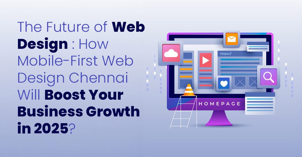
Mobile-first web design is a design philosophy in which the mobile users are prioritized from the very beginning of the development process. Instead of designing a complete desktop version and later, trying to “optimize” it for mobile, this approach begins with the smallest screens which will then scales upward to fit the tablets and desktops. This is the strategy that ensures that your core content, visuals, and navigation – all are optimized for performance and usability right from the beginning. Mobile-friendly website development focuses on what truly matters to the user: clarity, speed, and simplicity.
This is fundamentally different from traditional responsive design, which often starts with a desktop layout and later adapts it for smaller screens. The problem with the old method is that mobile versions often become an afterthought – resulting in cluttered menus, small fonts, and heavy elements that slow performance. In contrast, mobile-first design ensures that your mobile version is lean, efficient, and purpose-built for today’s on-the-go users. As Google’s mobile-first indexing continues to dominate search algorithms, having a mobile-first site means your business is technically aligned with how Google now ranks and evaluates websites.
In short, mobile-first design equals SEO readiness, and in 2025, that translates to brand visibility, customer trust, and market relevance.
3. Why Mobile-First Web Design Chennai Matters for Business Growth?
The digital success of a business depends on how well it adapts to user behavior and in 2025, that means optimizing for mobile. Here’s why:
- Increased User Engagement
Mobile users want immediate, seamless access to information. A mobile-first website reduces friction by prioritizing fast loading, touch-friendly buttons, and easy navigation. According to Think with Google, mobile-friendly websites with responsive website design lead to a 67% higher likelihood that users will make a purchase or engage with a brand.
When your website loads quickly, displays properly, and makes interaction effortless, users stay longer, explore deeper, and convert more often. Every second saved in page load time directly improves user satisfaction and that satisfaction converts into higher revenue potential.
- SEO Benefits
Google’s ranking algorithms are increasingly centered on user experience signals. A mobile-first design improves multiple SEO performance factors, including:
- Faster page speed: A known ranking factor under Google’s Core Web Vitals.
- Reduced bounce rates: Mobile-optimized sites retain visitors longer.
- Improved crawlability: Google can index your site more efficiently.
- Better rankings in voice and local search: Mobile-first sites align naturally with modern search behaviors.
A well-optimized mobile experience given by best web design services Chennai isn’t just about aesthetics, it is a technical SEO advantage that can significantly impact your organic visibility and brand authority.
- Competitive Advantage
Despite the rise of mobile, nearly two-thirds of business websites still fail Google’s mobile usability tests. This means that companies investing in mobile-first design today are ahead of most competitors.
A mobile-first website ensures you deliver what users expect accessibility, clarity, and convenience. In a competitive market where users make decisions in seconds, that’s the edge your business needs to win.
4. Key Elements of an Effective Mobile-First Webs
A mobile-first website must blend performance, design, and usability seamlessly. Below are the critical components that ensure your website meets user expectations and search engine requirements.
- Responsive and Adaptive Layouts
Your website should look perfect on every screen size, from a small smartphone to a large desktop monitor. Responsive website design layouts use fluid grids and flexible images, ensuring visual harmony across devices. Adaptive design takes this further by delivering optimized layouts for specific screen resolutions, improving both performance and aesthetics.
- Fast Loading Speed
Speed defines success in the mobile era. Every extra second your website takes to load can reduce conversions by up to 20%. At iStudio Technologies, we focus on technical optimization compressing images, leveraging caching, and minimizing scripts to ensure blazing-fast load times. We also integrate technologies like AMP (Accelerated Mobile Pages) and lazy loading, reducing unnecessary resource usage without compromising design quality.
- Intuitive Navigation
Mobile users prefer simplicity. Menus should be compact, easy to find, and logical. Key actions such as “Call Now,” “Buy Now,” or “Get a Quote” should always be visible without scrolling. We emphasize micro-interactions, animations, and user cues that make browsing more intuitive and engaging, reducing confusion and encouraging action.
- Thumb-Friendly Design
Mobile usage is dominated by one-handed operation. A thumb-friendly interface where essential buttons and CTAs are within natural reach zones drastically improves usability. This ergonomic mobile-first web design Chennai approach ensures your visitors can navigate comfortably, reducing friction in their journey from browsing to conversion.
- Minimalist and Purposeful Content
Cluttered content can overwhelm mobile users. A mobile-first design prioritizes clarity and focus, presenting key messages, visuals, and CTAs clearly. With limited screen space, every element must have a purpose delivering value or guiding action.
5. How Mobile-First Design Improves SEO and Conversions?
Mobile-first design and SEO are inseparable in the digital age. Google’s Core Web Vitals – LCP (Largest Contentful Paint), FID (First Input Delay), and CLS (Cumulative Layout Shift) – all measure how users experience your site. Here’s how a mobile-first strategy improves both SEO and conversions:
- Improved Crawlability and Indexing:
A mobile-first website provides clean code, structured content, and optimized metadata. Google’s bots can easily crawl and index your site, improving your visibility in search results.
- Reduced Bounce Rates:
Users who land on mobile-optimized pages are less likely to leave. A well-designed mobile-friendly website development reduces bounce rates which sends positive engagement signals to search engines.
- Higher Time-on-Site:
Fast, responsive, and visually appealing mobile pages encourage users to explore more content. This deeper engagement improves SEO metrics and builds brand loyalty.
- Better Conversion Optimization:
Streamlined mobile UX including simplified forms, touch-friendly buttons, and intuitive CTAs enhances the user journey and drives conversions.
- Voice and Local SEO Readiness:
Mobile-first websites naturally perform better in voice search and local intent queries like “best web design company near me.” Google prioritizes websites that deliver fast, relevant, and location-optimized content for mobile users.
In short, a mobile-first website is an SEO powerhouse that attracts, engages, and converts all while positioning your brand as a credible digital leader.
6. How iStudio Technologies Builds Mobile-First Websites?
At iStudio Technologies, our best web design services Chennai approach to mobile-first development is guided by a deep understanding of user behavior, search algorithms, and emerging technology trends. We believe that design should not only look good but also perform exceptionally well. Our Mobile-First Development Framework:
- User Research and Strategy:
We begin by understanding your audience, their device preferences, browsing patterns, and intent. This research shapes our UX strategy, ensuring every design choice supports your business goals.
- UI/UX Design:
Our creative team crafts intuitive, minimal, and visually engaging designs that align with your brand identity. Each element is purposefully designed to maximize usability and conversion.
- Prototyping and Testing:
We build interactive prototypes to simulate real user journeys across different devices. This allows us to refine interactions, animations, and content hierarchy before development.
- Responsive Development:
Using HTML5, CSS3, React, and WordPress, we create high-performance, SEO-friendly websites optimized for speed and scalability. Our responsive website design developers ensure perfect alignment with Google’s Core Web Vitals.
- Performance Optimization:
From image compression to code minification, every aspect of your site is optimized for lightning-fast performance even on slower networks.
- Testing and Quality Assurance:
We test across multiple devices, screen sizes, and browsers to ensure consistent performance. Rigorous QA processes guarantee error-free delivery.
- Launch and Continuous Optimization:
After deployment, we continuously monitor analytics, track performance metrics, and refine the site for sustained growth.
At iStudio Technologies, our best web design services Chennai don’t just build websites, we build growth engines that elevate your brand’s online presence and conversion potential.
7. The Future of Web Design: AI + Mobile Optimization
As we look beyond 2025, the next frontier in web development lies in the integration of Artificial Intelligence (AI) with mobile-first design. Together, they form a powerful combination that personalizes user experiences, predicts behaviors, and optimizes performance automatically.
- AI-Powered Personalization
AI analyzes browsing patterns, session durations, and conversion data to deliver personalized user experiences in real time. For instance, a returning visitor might see customized product recommendations or tailored landing pages all dynamically generated by AI.
This level of personalization creates stronger emotional connections with users and significantly boosts conversion rates.
- Predictive Analytics and Smart Layouts
AI-driven analytics can anticipate user actions. For example, if data shows that users frequently drop off at a particular point, AI can recommend layout changes, reposition CTAs, or adjust content flow automatically improving user experience and reducing abandonment rates.
- Voice Search and Conversational Interfaces
The rapid adoption of smart assistants like Alexa and Google Assistant has made voice search optimization a necessity. Mobile-first web design Chennai supports this through structured data, conversational content, and natural language patterns that improve visibility in voice-driven queries. By 2025, voice searches are expected to make up over half of all online queries, making mobile optimization crucial for capturing this audience.
- AI Chatbots and Real-Time Support
AI chatbots integrated into mobile-first websites can provide instant assistance, 24/7. From answering questions to scheduling appointments, they enhance user satisfaction and drive conversions without additional human intervention.
This blend of automation and human-like interaction creates a smarter, faster, and more intuitive mobile experience.
8. Conclusion:
Build a Future-Ready Website with iStudio Technologies: The digital future belongs to brands that adapt and in 2025, adaptation begins with mobile-friendly website development. A mobile-optimized, SEO-friendly website is not just a competitive advantage; it’s a fundamental requirement for survival and growth. By investing in mobile-first web design, you’re not only enhancing user experience, you’re aligning your business with Google’s algorithms, boosting engagement, and securing long-term digital authority. At iStudio Technologies, we combine creativity, technology, and data intelligence to build mobile-first websites that perform exceptionally well across all metrics. From design strategy to technical SEO, every aspect of our process is designed to help your business rank higher, convert faster, and grow smarter. Want a mobile-optimized, SEO-friendly website that drives measurable growth?