The focus of web designers as well as marketers for years has been mobile and responsive designs. In April 2015, to promote websites to use mobile or responsive design, Google made mobile-friendliness an official ranking factor in its search algorithm.
Continue reading to know more, and give us a call at 088070 30902
As the best web design company in Chennai, India our highly experienced and professional team will give you the complete detail about web design that suits best for your company.
How does mobile website works? What are its PROS and CONS?
As the top website design company in Chennai, India we have created the most successful websites and are dedicated in making your company lead your competitors in the digital platform.
Pros
- On smart phones , mobile sites could run more easily.
- Mobile websites could be configured even more relentlessly than regular websites.
- They seem to be more flexible, quicker, and more effective as a whole.
- Normally, mobile websites boost the user experience.
- Each of these variables combine to imply that user experience for web devices can usually be improved by a mobile site.
Cons
- Dual maintenance is necessary for mobile sites.
- They typically need a comparable level of maintenance like their desktop version to continue running, with mobile sites effectively self-contained websites in their own right.
- Content will become old rapidly.
- For mobile websites, content is worth mentioning in specific.
- The issue is that every website that changes its content frequently, would need to update its web page content also.
How does responsive website works? What are its PROS and CONS?
We are the best web design company in Chennai, India who build the most finest websites that run without glitch and will uplift your business to the nest level.
Pros
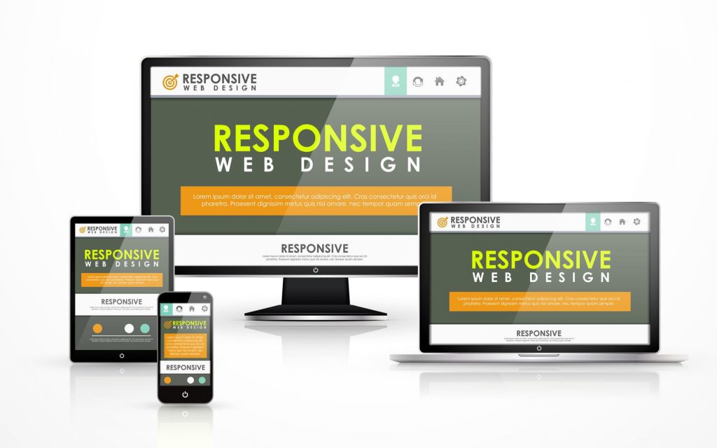
- Almost for any computer your clients can use, it's a good system to display your website in a user-friendly way. This, in itself, is a major advantage.
- On a desktop computer, a TV screen, a smartphone, and even a 4-inch smartphone, a sensitive platform will look extremely great in an ideal scenario.
- The versatility provides some essential sense of comfort for website owners.
- The next major advantage, particularly over mobile sites, would be that all of this is stored in one body of information.
- You will not have to re-build that page for a mobile platform, for your large - screen desktop, or for any such screen you might want to optimise for if you create a great webpage.
- You build that once and container you place it in will move the objects automatically to match the screen on which it displays.
- And it therefore signifies is that it would be easier to manage, update, and edit any content you create, because you only have to do this once.
Cons
- First, although responsive sites are working on mobile devices, a stronger mobile experience can usually be provided by certain device-specific resources.
- Furthermore, it’s very high responsiveness is greatly restricted in responsive design.
- As you only hold a single body of content, you could only generate a website experience which fits one group 's requirements.
Do you want to know more about responsive web design?
Call us at 088070 30902 or online to talk with our experts now!
Who should use mobile website?
- Advances in user experience (UX), could benefit from just a mobile site.
- For mobile pages, websites with proven processes, where users would like to perform the exact few tasks over and over again, are perfect.
- These channels have low content loads and appear to be far more hands-off items once the approach is in place than the other website types.
- Pages which need to be constantly updated with loads of content, such as a blog or an e-commerce website, seem not to be just as well fitted to mobile sites, even if there are back-end systems in place to enable successful multi-site management.
Who should use responsive website?
- Organizations that are predominantly dependent on mobile traffic will do well to be receptive.
- If the bulk of your traffic comes from desktops, it's much less essential to trade off unique features.
- Active design should also be considered by organisations that update content on a regular basis.
- When you update weekly or every day, the task of managing two sets of content easily overwhelms content team members-it is just too time-consuming.
Which is the better, mobile webiste or responsive website?
The winner is whatever platform fits best for your company in the competition between responsive versus mobile sites.
A mobile site is better if
- Your clients use smart phones for the most part.
- Tablets and smartphones are common communication tools at this stage.
- If your customers display a clear preference for mobile devices, a mobile website is pretty much safe to use.
- Your budget is relatively limited.
- Although mobile sites is not inexpensive, they don't need that much money or monitoring as responsive sites.
- But if your investment is a little small so you don't think that in the future you're going to really need responsive design, then develop your company site with a mobile website.
On the other hand, a responsive site is better if
- You update the website regularly.
- Responsive design is your option if you don't have a way to rapidly upgrade your desktop and mobile pages at same time.
- Regular updates are only simpler if you have a responsive website, if you are bringing in new pages or writing blog posts.
- You're redesigning your website.
- It may be better to build from scratch as the site grows older and difficult to maintain.
- So if you're going back to the design board, you can just make one website that will operate on almost any computer in the world!