Since the advent of websites, web designing arena is undergoing frequent changes across times and delivers the best visuals to the viewers to make them stay longer with the website.
It is undeniable that the importance and role of portable devices like tablet, smartphones are kept increasing since their arrival with the expanded base of users.
Creating a responsive web design is no more a trend, and we are the promising web design company in Chennai, India who look out for scope to create a better designing output that would facilitate our clients in a 360° viewpoint.
Here in this blog, we will be looking at the core difference between responsive web design and mobile-first design methods and our constructive approach towards creating an effective mobile-first design website.
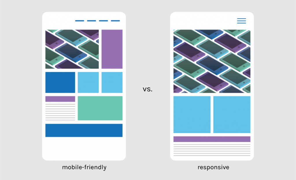
Difference between Responsive web design and Mobile-first design
Globally 52.64% of website’s traffic gets generated from a mobile and 7% generated from tablets.
Creating a responsive web design is a tedious process which involves building a desktop-friendly website initially and then converting it into a mobile, laptop and tablet friendly website according to the need.
Building a responsive website design demands high dedication and prone to the risk of getting deterred due to amature approach.
There are high chances of failure because of the nature of the process, and hence, it requires some alternative.
Mobile-first design is found to be the best alternative it creates a single design that fits with all the devices, and moreover, it gives priority to mobile devices.
How we create the best mobile first web design for our clients?
Similar to other designing innovators, we also faced certain troubles in the initial stage in creating a flawless mobile-first website design.
Over a period, we learnt a lot and framed our unique strategy in creating a highly successful mobile-first design for your website.
Let us view these approaches without wasting time.
Maintain less is more for content
Yes, you heard that right, providing deep-rooted content which would create high impact at a minimal count of words is the greatest challenge and the path towards creating the aptest content for a mobile-first website design.
Being an innovative website design company in Chennai, India we take every step keeping the mobile users in mind and break down the content to depicted into single line phrase, to make things easy for the readers.
Make it simple- Website
Maintaining minimalization is essential to bring the mobile-first design method into implication for any website, being a prolific web designing agency in Chennai, India we practice the best minimalization method that embeds six important rules:
- Avoid unwanted pages in the site
- Adding advanced search features
- Increasing whitespace to reduce clutter appearence
- Using wide borders and clean lines
- Using simple and larger font
- Maintaining two columns in the mobile

Ensure to have updated CTA (Call to Action) buttons
Google have created seperate algorithm for mobile search

Just think about having a non-functional CTA button that should direct the home page visitors to lead conversion page where they can provide their details and requirement, so ensure to have a good functional button to get proper leads online.
Our enhanced web design services in Chennai, India, will help clients to have call-to-action buttons at the right spot to generate maximum leads.
Interactivity
Create or ensure to have the most interactable contact form on your website to convert any visitor into a client, implementing a chatbot is also a good idea since it can heal up the wound created on client generation chaos and other disorders. We provide futuristic website designing services in Chennai, India that includes a useful contact form or chatbox that generates sales.
Graphic Design- Mobile First
You might be thinking that what would be the link between graphic and website designing but stats say that graphic design implementation has brought in 200% growth when compared to ordinary web design.
The implication of graphical design would certainly bring in reliability, longevity in memory and ease of use. Being the most promising website designing service provider in Chennai, India, we follow some prominent graphic design trends and practice the same for our clients.
- Vivid colours
- Impactful Typography
- Geometric shapes and abstracts
- Light and dark contrasting schemes
- Gradients and duotones
- Hand-drawn illustrations
- Real photographies
Speed is important
40% people leave a website if it takes more than 3 seconds to load
79% people abandon the online store if the site loads slower (more than 3 seconds)
Speed is a concerning factor that determines the success of mobile-first website design, to ensure the speed is under control or proper we implement some basic parameters that would evaluate the exact speed.
- Constantly checking the site’s speed in “Google’s Test my Site”
- Installing CDN to load any content from cache files.
- Involving in image compression
- Can use lazy load to evacuate unnecessary elements
- Using https into the website to bring in security, risk free and flexibility

Testing
Android holds 75% of market share

Testing is highly mandatory to deliver flawless service in assured time, so according to me, you need to be very much intentional in getting the right product out for your customers. We being the leading web designing company in Chennai, India, undergo the 3-tier testing process to maintain the quality of the service.
Conclusion
The trends and transformation of responsive website design is always a never-ending story but to keep updated with these trends, and transformations are essential to exhibit our uniqueness.