
Introduction
The responsivity as a feature has become highly mandatory for any website today, and any business organization irrespective of its size and industry will eventually collapse in the online world if they don’t possess a well-structured device-friendly website.
Here, in this blog corner, we will be discussing some important stuff that highly influences the success of responsive web design.
Why Responsive Website Design is Important?
- 8 in 10 website visitors enters through portable devices like smartphone or tablet.
- Contribution of mobile responsiveness to website traffic is 79% at the end of 2018.
- 83% of website visitors are looking out for website designs that are both mobile and desktop friendly.
The above statistics depict the importance of the responsive factor in driving high traffic and generating more revenue to a business, and it requires some best practices.
Responsive Web Design and Screen Resolutions
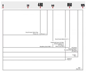
Creating a completely responsive website design involves building a website that fits well with devices with diversified screen resolutions and displays the required information flawlessly according to the end-user.
Being a spectacular web design company in Chennai, India, we create the perfect design for your website that reaches every user irrespective of the device they hold and establishes a brand identity for your business.
Here I have classified devices according to screen-size and their usability ratio in a global level when it comes to website access.
- Small-screen mobile- 360*640 - 22.64%
- Medium-sized mobile screen- 375*667 - 5%
- Large- sized mobile screen- 720*1280- 2.74%
- Medium-sized laptop screen- 1366*768- 11.98%
- Medium-sized desktop screen- 1440*900- 3.17%
- Large- sized desktop screen- 1920*1080- 7.35%
Responsive Web Design and Web Browser
Similar to devices, there also exist different varieties of browsers that displays a website and its functionalities on their perspective according to their target users.
We are the most experienced website designing company in Chennai, India having prolific designers, who are highly expertise in creating browser-centric responsive website designs.
Market share of web browsers according to mobile website access in 2018:
- Chrome- 55.4%
- Safari- 14.86%
- UC Browser- 8.69%
- Firefox- 5.72%
- Opera- 4.03%
- Internet Explorer- 3.35%
Responsive Web Design top practices
Prefer the need
There is always a famous quote stating “what we need is what we want?” but “what we want may is not necessarily what we need”?.
The quote mentioned above perfectly suits for creating a well-crafted responsive website design, especially when it comes to projecting a website for tablet or smartphone users.
Providing precised and much-needed info will be the top priority in designing a website for small-screens that includes the projection of products/services first and then the company’s portfolio followed by experience.
We deliver splendid web design services in Chennai, India that satisfies the goal of responsive web design 100% and delivers maximum results.
Responsive- Thumb rule for Success
Framing a responsive website design is a crucial process that involves complex steps to be considered before implementation to bring out the essence of responsiveness in the website.
The touch and feel factor highly varies between a desktop and mobile were, desktop views involve clicks and mobile views involve swipes.
On the other hand, physical factors also are taken into consideration while creating a responsive website, where the desktop found to be grounded whereas, we use mobiles using hands.
All these changes bring in a huge difference in the UI of a website design that affects interactability and target user intentions.
Being the best web designing company in Chennai, India we ensure to cater user-friendly and responsive designs for your website that primarily focus on user’s comfort.
How thumb rule brings transformation in website responsiveness?
- Navigability of a website is the first concern that witnesses the difference in usage amongst the website visitors were, they prefer navigation bar in the top of the website and the same at the bottom when it comes to mobile because thumb finger is not comfortable in reaching to the menu bar every time while proceeding with the navigability.
- Thumbs prefer most of the information to be present in the mid of the screen, as it feels uncomfortable while moving to the corners to search out for information, especially when they are found to be important.
- Highly important links and call-to-action buttons need to get maintained at a minimum height of 44 pixels to safeguard the usability factor and retain the visitors.
- Highly important links and call-to-action buttons need to get maintained at a minimum height of 44 pixels to safeguard the usability factor and retain the visitors. Thumbs aren't comfortable enough with micro-sized buttons and miniature links.
We provide state of the art website design services in Chennai, India that counts even a minute element contributing towards responsiveness of a website.
Making good use of mobile hardware features
While talking about responsive website design, it is not just about creating a well-fit design for devices, it also counts implementation of functionalities, that struggles to operate in a desktop-like:
- Credit card scanning facility
- Easy photo sharing via social media
- Secured two-factor authentication
- Attaining insights easily on outcomes
- Doing voice search over web search

Choosing between fixed and fluid layout design
The responsive web design is an oceanic concept which involves several factors considered to build a website a minimized window will look entirely different from the normal one either it is in desktop, laptop, tablet or mobile phone. Being a leading web design company in Chennai, India, we bring the wholeness in the responsive factor of a website to ensure user retain-ability to the core.
Typography Responsiveness
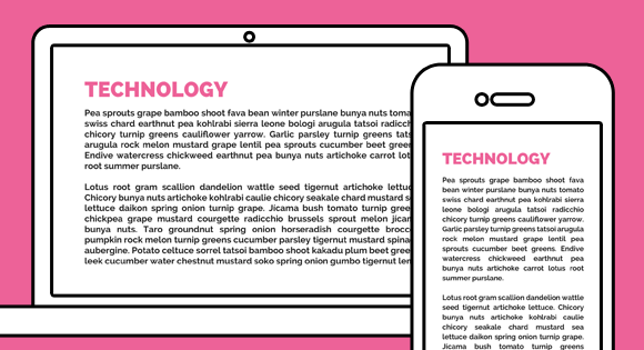
Not just pixels even typographies are influenced and contribute towards the responsive factor where a content represented at a particular font size say 12 with a particular font style and category will look different according to screen resolutions. We are an eminent website design service providers in Chennai, India who care for typography equally to that of images and pixels.
Conclusion
Attention to detail is highly essential when it comes to responsive website designing and we carry out it seamlessly in framing every responsive website.
Being a reputated player in delivering promising web design services in Chennai, India we offer best web designing services at affordable cost with end-to-end features that helps them to acquire all the screens in multiple devices and generate exponential ROI through earning diversified potential client base.